Nasuni Web Access
Web Access had been around for years, and most people still preferred another way to get to their files. The aim was a product useful enough to become part of their daily work.
- Role
- Senior UX/UI Designer, May 2025 to present
- Practice
- First UX practice at the company
- Covered
- Research, strategy, UX, UI, accessibility, AI-assisted workflows, testing and delivery
- Worked with
- Product, Engineering, leadership and stakeholders
Where it started
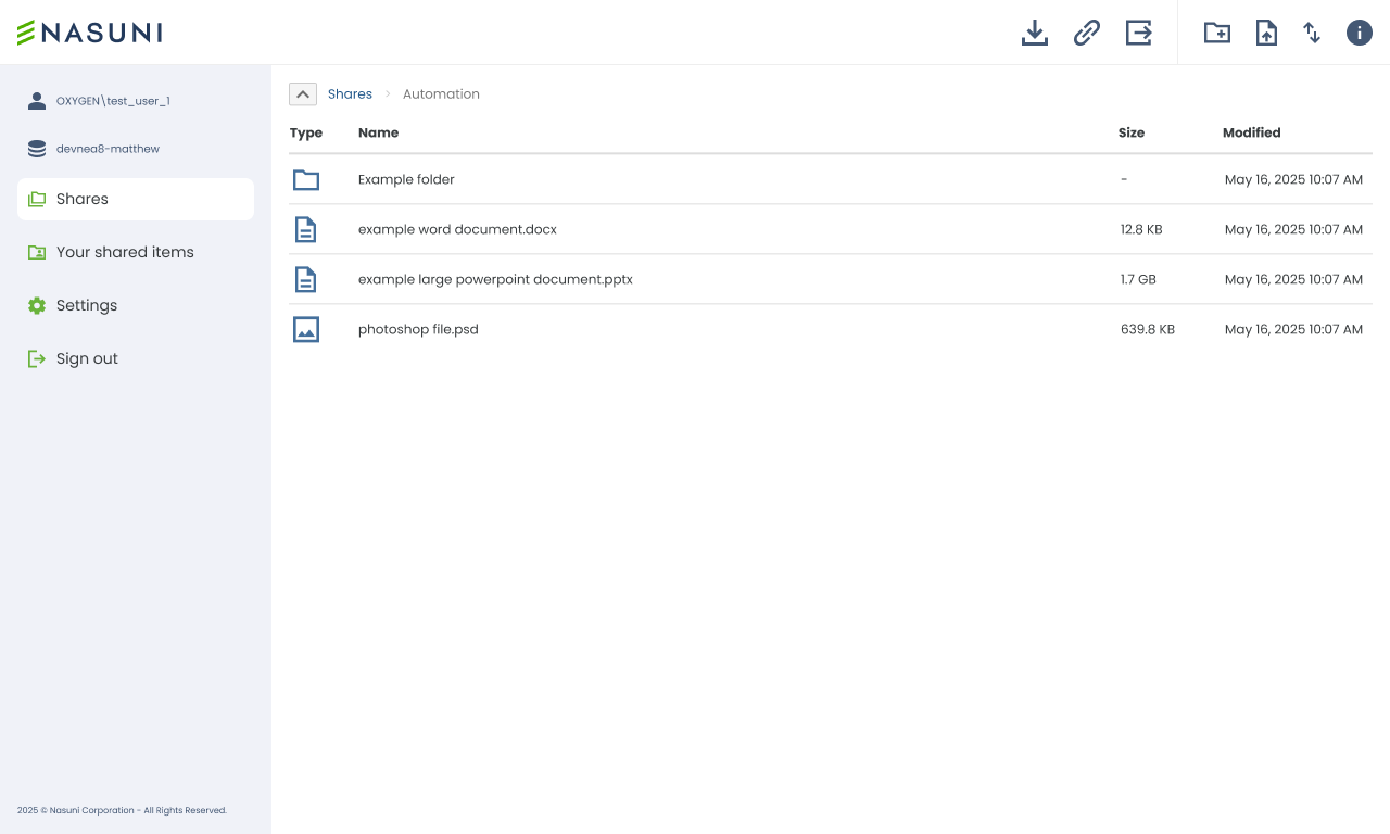
When I joined Nasuni, Web Access had been live for around five or six years. Engineering had designed almost all of it, with no formal UX practice behind them. It was functional, dated, difficult to navigate and missing some of the everyday features people expect from a file browser.
A lot of actions were icons without labels. Technical language had crept into the interface, and you often needed the documentation to find out what a control actually did. Web Access also sat awkwardly next to the other ways of working with files, and most users stuck with SMB.
The brief was to look after UX across Nasuni’s customer-facing products. Alongside the immediate problems sat a larger one: giving customers a reason to choose Web Access over SMB.
Starting with what we knew
The groundwork meant time with the teams to understand the system, exploring it first-hand and running heuristic evaluations. Existing tracking and support data came next, along with conversations with stakeholders, and the result was a prioritised view of the issues.
Direct customer research was hard to arrange at first. Rather than wait for the perfect research setup, the first stage made the most of the evidence already available, while the structures and testing methods went in so that user feedback could become a normal part of how the team worked.
Priorities were agreed with Product and Engineering, weighing user needs, business direction and the problems already known. Some were quick usability fixes. Others needed a proper rethink.
Working out where it could go
Working with the PM and PO, ideas for what Web Access could become started to take shape. Discussions and rough Figma work came first, then a more detailed interactive prototype, named Northstar, that brought the backlog and future possibilities into one place without pretending every detail was solved.
The direction was tested with Lyssna and external participant panels, then shared with stakeholders, which helped secure agreement for a longer-term roadmap. Northstar set a direction rather than a specification. Each feature still needed its own research, design and testing as it was built.
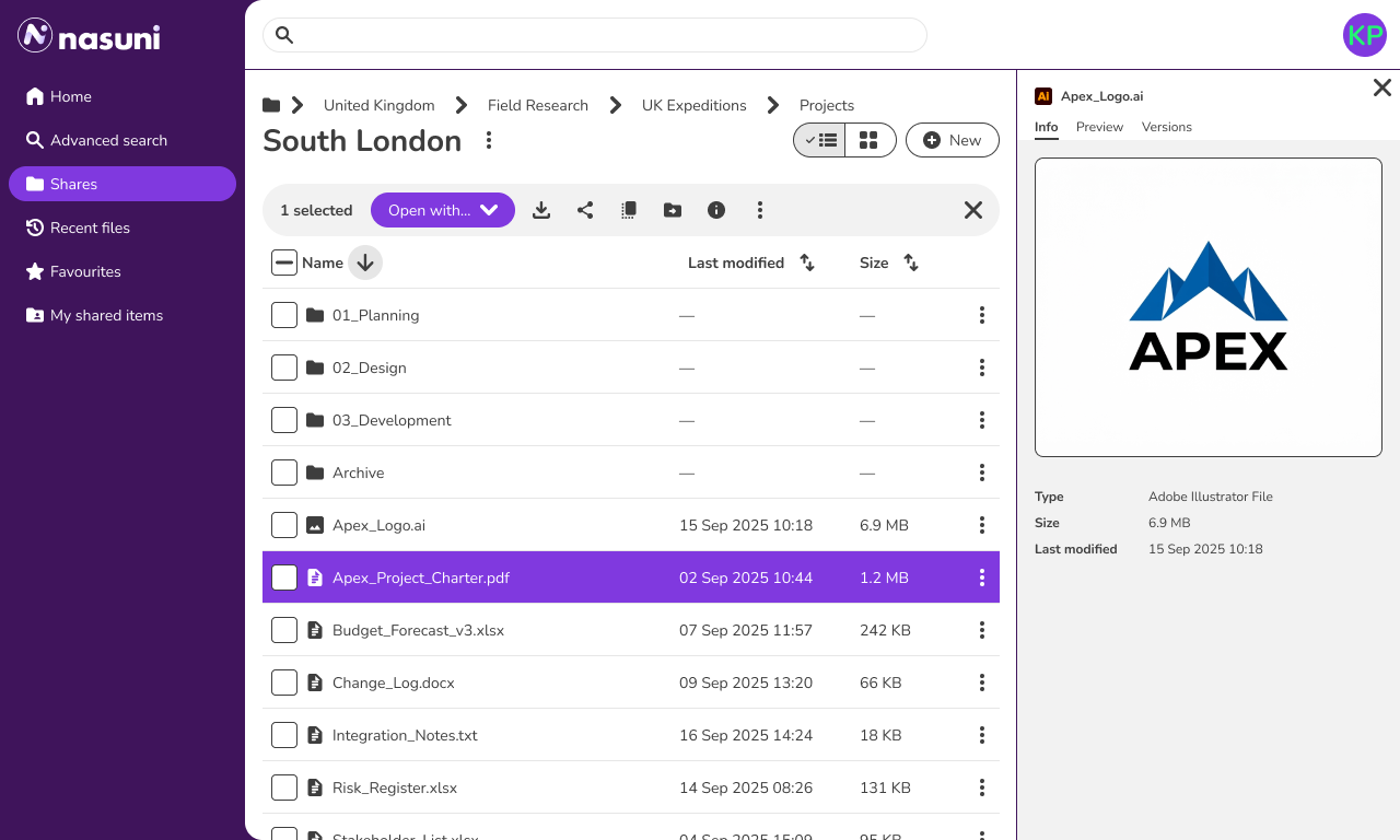
- Find things faster. Search, filtering, thumbnails, recent files, favourites and a clearer file structure.
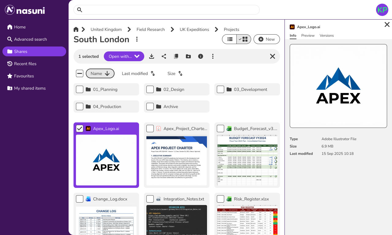
- Work with files properly. Previews, tagging, ownership, grid view, copy, move, rename and more useful contextual actions.
- Know what’s happening. Better feedback for uploads, downloads, background tasks and notifications.
- Connect the wider workflow. More capable sharing, Microsoft integration, external services and future AI possibilities.
These were areas explored in the product vision. Not every feature shown has shipped.
Testing
Participants spanned different ages, countries, company sizes and levels of technical confidence, with a target of at least 15 per round for a reasonable spread of feedback. Sources were a mix of Lyssna panels, internal testing and customer input, depending on what was being tested.
Testing rarely produced a dramatic redesign. More often it showed people could use what had been made, then pointed out the small things: a label, the order of two buttons, a piece of wording.
The rebrand testing went differently from expected. Four visual treatments were tested, and the lighter, neutral options were expected to do well. Participants preferred a more defined purple sidebar. That direction went ahead in a darker shade than the main brand purple, which was too intense for long sessions.
Building it in phases
The fundamentals came first: clearer labels and language, better keyboard and screen-reader support, more predictable actions and less visual clutter. Alongside came the bigger improvements: activity tracking, search, previews, copy and move actions, clearer folders and Microsoft integrations. Engineering delivered the major platform initiatives, including SSO implementation and React-based interface improvements.
The customer-facing experience shown here, from the broader navigation and layout to component behaviour and interaction details, was designed in phases with Engineering. Individual features were tested along the way rather than expecting the original Northstar prototype to answer every question.
Local Edit and SSO
Opening files
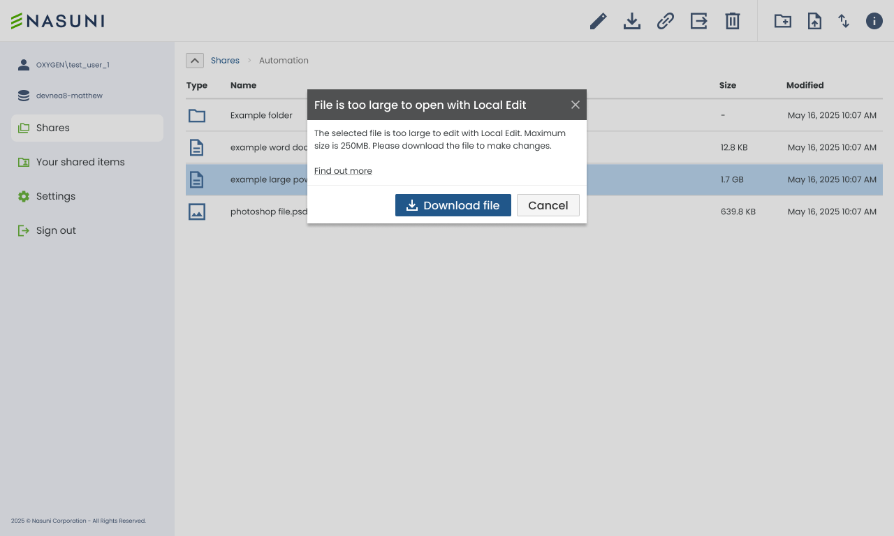
The old “Open in Local Edit” action could fail without telling anyone. If the desktop application wasn’t installed, or the request timed out, nothing visibly happened. The connection between the browser and the desktop app was largely one-way, too.
The hand-off was redesigned so users were told what was happening, including when the application needed installing. Uploads, downloads and error feedback moved into native operating-system controls, where people were already working. The newer Nasuni App is building on this with more desktop capabilities.
Signing in with SSO
Customers needed SSO for security, but the original infrastructure made it a fairly involved journey. Users had to connect to the right customer-managed server, authenticate and sometimes link Active Directory credentials. Not every customer needed every step, so a conventional progress bar would have been misleading.
The focus was on plain-language instructions, useful validation and setting expectations. More recently, newer technology has allowed a cleaner layout, clearer actions, server selection linked to business credentials and waiting states that actually tell users something is happening.
Building the UX practice
A new component library, built with accessibility and consistent interactions at its core, ran alongside the redesign. It started on the old brand and was reworked for Nasuni’s new identity, whose contrast challenges made some choices less straightforward. WCAG AA stayed the minimum regardless.
Engineering got reusable components with the behaviour already worked out, which cut repeated discussions and the risk of different solutions to the same problem. A Storybook connection let component updates feed into development more easily.
AI is part of the design workflow in three ways. Assisted validation checks Figma designs for accessibility and against the component library, and produces a list of issues for UX to investigate and fix. Tone-of-voice prompts and skills keep interface content consistent. And Figma is linked to a skill that helps build PRDs, integrated with Engineering’s own skills. The tooling was evaluated before it was adopted, and the reusable workflows improved consistency, cut manual effort and sped up delivery across the UX team.
The design specs add screen-reader considerations alongside functionality, acceptance criteria, flows, validation points, scope, assumptions, component and flow requirements, dependencies, risks and constraints. They help Engineering write their PRDs and leave less to interpretation. UX stays involved through development, answering questions and reviewing builds, and most changes after handover are small clarifications, not redesigns.
What changed
Web Access has gone from an ageing alternative to SMB to something people actively use in their day-to-day work. Adoption and retention have increased significantly, and being able to reach files from anywhere with an internet connection has helped bring in new customers. The Local Edit changes also brought better adoption, fewer support enquiries and fewer abandoned flows.