Kyra
Kyra had no product design team, no engineers yet and a creator-marketing business running on emails and spreadsheets. Over three years that became five connected products for creators, managers, brands and Kyra’s own staff.
- Role
- Head of UX & Design, May 2022 to May 2025
- Team
- Built and led a three-person design team
- Covered
- Research, strategy, UX, UI, design systems, mentoring and delivery
- Platforms
- Creator Hub, Manager Portal, Brand Portal, internal platform, AI discovery
72%Month-one retention, measured as people opening and using the app at least weekly
6,000+Creator sign-ups in the week after the App Store launch
£15MGlobal partnership with L’Oréal that the product helped secure
Where it started
Kyra began by connecting brands with creators and managing campaigns largely by hand. Briefs, negotiations, video submissions, feedback and reporting travelled between inboxes and spreadsheets. There was plenty of expertise in the business, but very little of the process lived in a product.
The role started alongside the first product manager, before an engineering team was in place. There was no existing app to redesign. The job was to work out what should exist, who it was for and how the pieces would fit together. The Creator Hub came first, built on interviews with creators and the knowledge of Kyra’s campaign specialists. As more came to light it grew into a much larger ecosystem.
The five products
- AI discovery. Brands and Kyra’s team find niche creators through natural-language search, video content and performance data.
- Brand portal. Brands submit campaign ideas, choose creators, approve work and follow the results.
- Internal platform. Kyra’s team manages briefs, shortlists, feedback, deadlines, budgets, payments and reporting.
- Creator Hub. Creators find briefs, negotiate rates, submit videos, make changes and share their live posts.
- Manager portal. Managers run the same workflows for several creators, with each creator kept separate.
The products depended on each other. Adding a feature to one usually meant changing something in another. Each product had its own PM, so Product, UX and Engineering regularly got together to work out which journeys were affected and what the design had to do about it. Product and Engineering planned and owned delivery.
Creator Hub
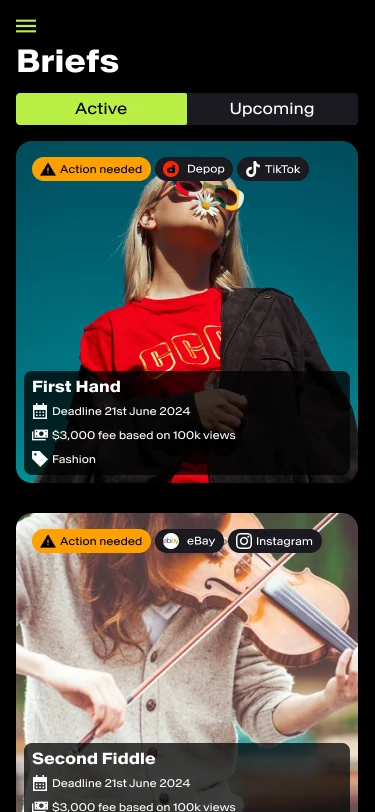
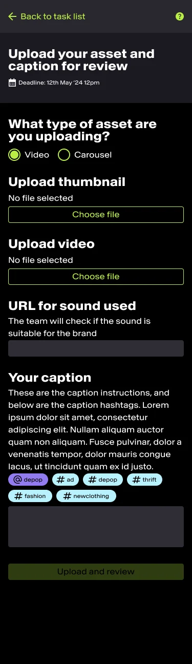
The first product was a mobile-first app. Creators could find brand briefs, put themselves forward, negotiate a fee, submit draft videos, respond to amendments and connect their published TikTok content for tracking.
Research showed that creators mostly used their phones, that many relied on managers to negotiate and post for them, and that they were often unsure what to charge or where the next contract would come from. Those findings shaped the product itself as well as the screens.
Pricing by creator
An algorithm used TikTok data, including views and engagement, to suggest a rate for each creator and campaign. It sat next to the work and deadline so creators could judge it in context. They could propose their own fee instead. The brand then saw that figure with Kyra’s fee added and chose who to work with.
Feedback
Kyra’s specialists could leave overall comments or comments at specific timestamps. Earlier versions stayed available internally, while creators saw one clear, current review instead of a version history. The team was trained to give feedback people could act on.
From approval to live results
After approval, the creator posted to TikTok and entered the link in the app to start tracking. Kyra’s team and the brand followed the same campaign from their own side.
Managers
The research led to a separate, responsive Manager Portal. Managers could run workflows for several creators, but only ever saw one creator’s information at a time. Names and avatars stayed prominent at every decision point to reduce the chance of acting for the wrong person.
The Creator Hub drew 6,000+ sign-ups in its first week after the App Store launch, with 72% month-one retention.
AI discovery
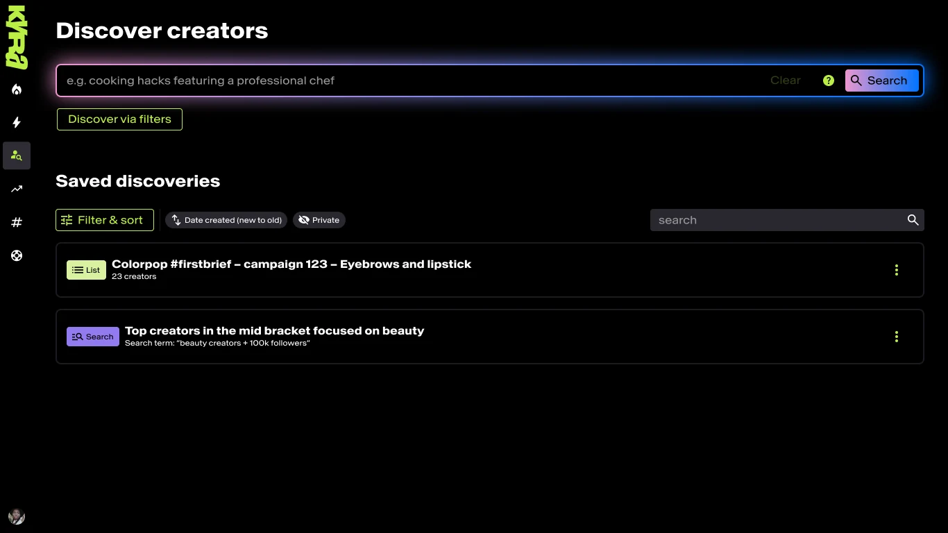
Kyra’s bigger ambition was to change how brands find creators. The AI system scanned thousands of TikTok videos an hour and built a searchable database. A brand could search for something very specific, such as green lipstick, and find relevant videos even when nobody had put it in a caption, said it aloud or added a hashtag.
Design covered the experience that made this usable: natural-language search alongside familiar filters. Results combined videos, accounts, views, engagement, comment sentiment, estimated costs and previous Kyra relationships. The aim was to help someone judge a creator, not just find a matching video.
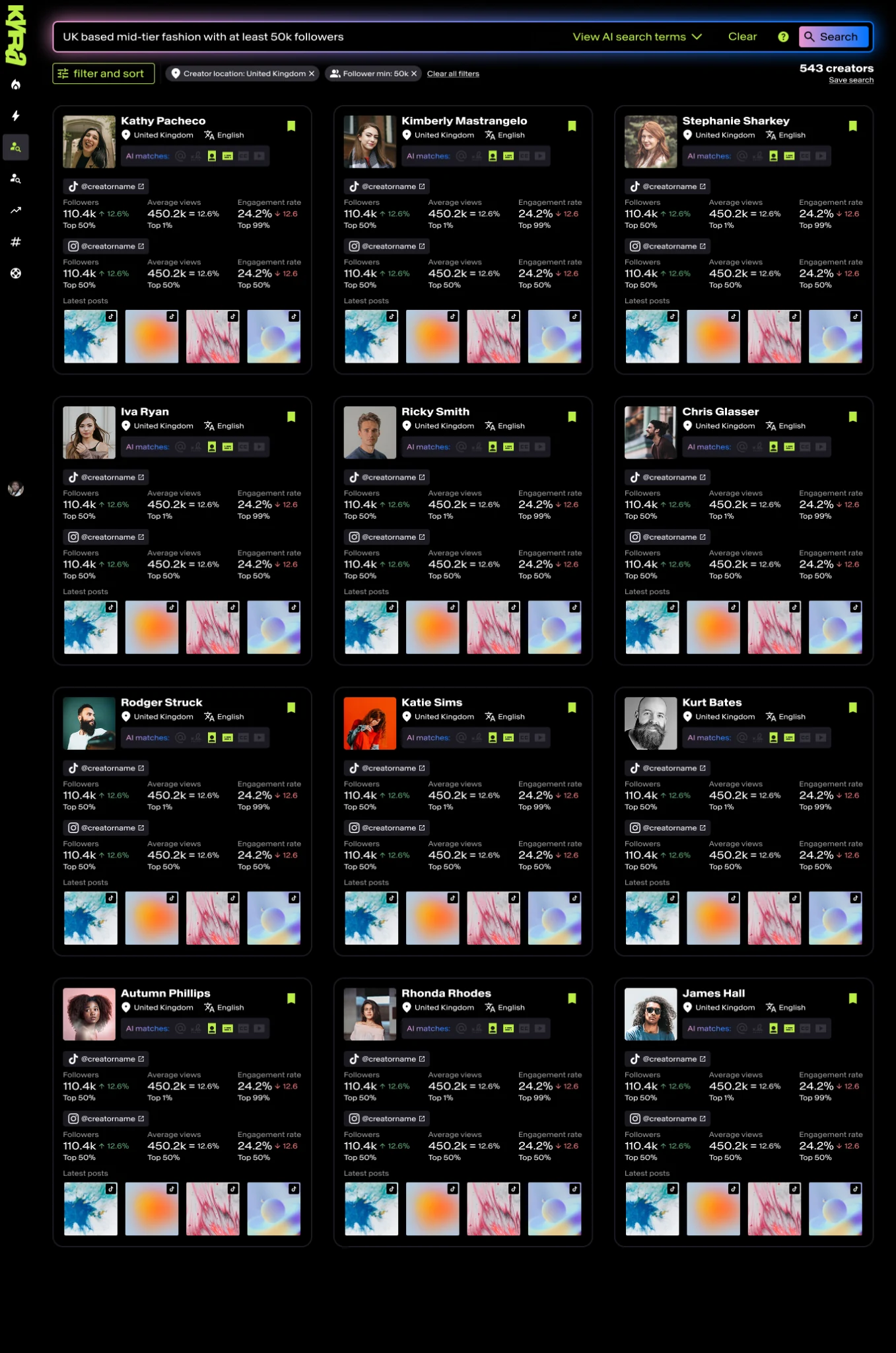
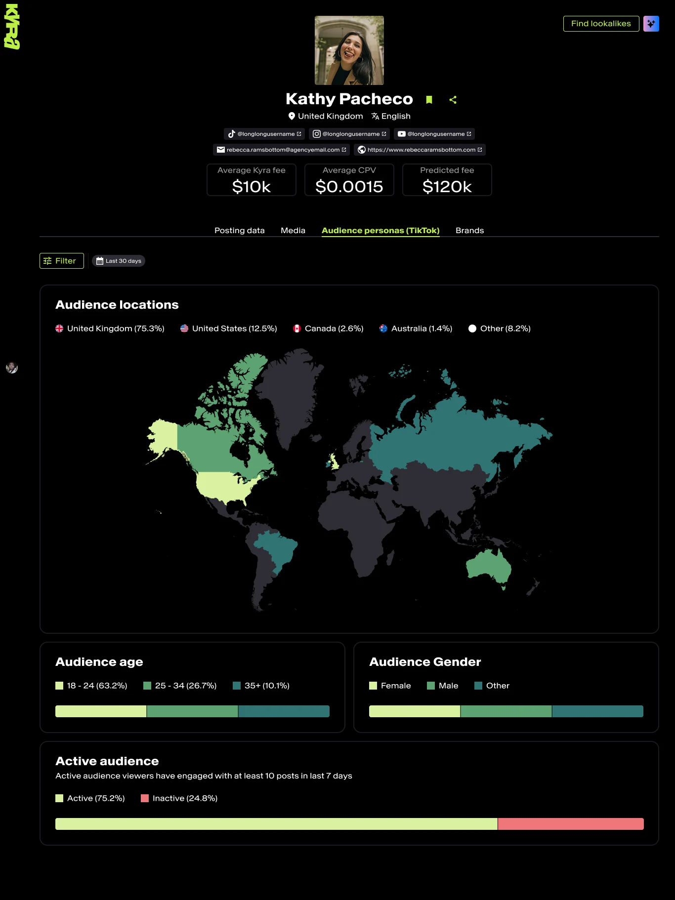
Testing ran as guerrilla sessions, moderated sessions and remote tests in Maze, and the words people actually typed went back into improving the model.
Testing showed that people wrote to the search as they would to a person, with conversational filler, polite requests and sometimes thanks. Clearer examples went into the search field, and the model was refined to read the intent and ignore the rest. Thumbs-up and thumbs-down feedback on results fed back into the AI.
The product was still new at the time of leaving. Usage and outreach were tracked, and it had attracted major clients and well-known creators, but there are no mature performance figures worth publishing.
Brands and operations
The creator experience only worked if the teams around it could keep things moving. Kyra’s internal platform sat between creators and brands and handled briefs, shortlists, reviews, approvals, budgets, payments and campaign analysis.
Staff were assigned to the briefs they worked on, and tasks and notifications appeared as a campaign progressed. People focused on one campaign at a time and opened more browser tabs when they needed several. Centralising this saved several hours of admin a week that used to go on chasing emails and updating spreadsheets.
For the brand portal, workshops uncovered brands’ frustrations with Kyra and similar services. The campaign request form was deliberately simple, based on the emails brands already sent. Beyond that, brands could review creators, approve videos and track performance, including a view-based return-on-investment measure instead of direct sales. Automated TikTok video boosting came later. Dashboards refreshed with performance data every 30 minutes.
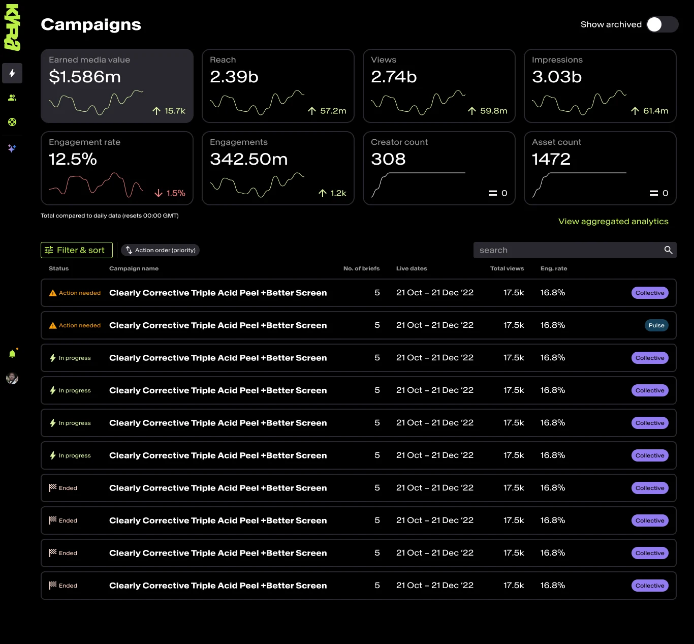
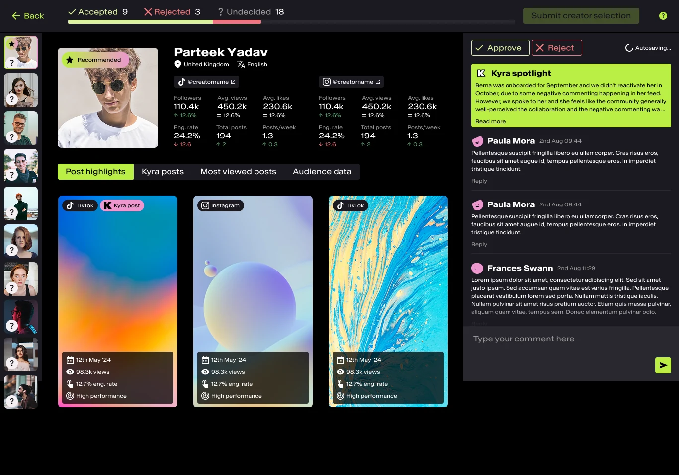
A campaign moved through six steps: brief, match, select, review, go live, track.
Building the team
There was no design team at the start. The first hire was a junior designer, after writing the job listing and running the interviews. A colleague moved from graphic design into UX after showing interest, with mentoring through the change.
The three of us divided product ownership by strengths and interests. Each designer led a platform, with several critiques a week, mentoring sessions and regular check-ins, so nobody designed in isolation. Day to day, that sat alongside close work with the founders and executive team to line product investment up with commercial goals.
A shared component library kept the products consistent. Engineering maintained manually built Storybook components, with HTML and CSS contributed from design to help with styling. It made coordinating changes easier and stopped five products drifting apart.
Managing performance
Part way through, one junior designer’s work fell well below the standard they had reached earlier. Employment matters went through HR. The quality of the work was a separate problem for design management, and it was handled separately: reviews became more frequent, mentoring tighter and the expected standard clearer, and the work returned to its earlier standard.
The rebrand
Kyra started out bright and high-contrast, with heavy black outlines and a deliberately youthful feel. A later company rebrand moved to a more restrained black and lime identity, meant to work for creators and for a more commercial audience.
Planning the platform changes with PMs and Engineering meant defining how the new guidelines would work as an accessible system. That included checking type contrast, and thinking beyond the desktop: how mobile screens behave in glare and changing light. The change was big enough that the visual updates were held for one company-wide public launch, instead of being released gradually as usual.
Outcome
Five linked products, a three-person design team, a shared design system and a way of working that put research into product decisions.
The internal platform saved staff several hours a week. During user testing, L’Oréal saw what was being built and asked Kyra’s founders and sales team for demonstrations. The AI creator finder, Brand Portal and campaign data drew the most interest, and the resulting £15M global partnership brought L’Oréal and associated brands’ main campaigns to Kyra.
An early AI Discovery prototype, built with the founders, also became central to investor presentations, because it communicated the vision before the full platform existed.
These are product and business outcomes from a team, with no claim to sole credit. The interface images are historical final designs, and names or figures inside them may be sample data.
What I’d do differently
Two things. A tighter user-centred design system, so that every product followed the same research, design and testing steps from the start. And a better way of managing design versioning across five products moving in parallel.